Saturday, February 4, 2012
Back to Basics
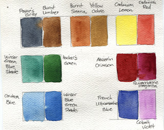
With several upcoming painting projects in mind, it was time to update my watercolor color wheels and palette map. Many years ago I decided to work with a very limited palette of watercolor pigments. Since I do so much travel sketching and journaling, I use a small portable palette and the fewer colors that requires, the better.
I have 14 colors on my palette (top), but the Payne's Gray and Cobalt Violet, both good mixing colors almost never get used. Cerulean blue, Winsor Green (Blue Shade) and Burnt Umber are rarely used too - in fact, those five colors had no place in my color wheel exercise. Burnt Sienna and Fr. Ultramarine Blue I use the most - together they make all the wonderful browns, neutrals and shadow darks you could ever want. The scanner couldn't quite fit the 9" x 12" piece of paper this exercise is on, so the Cadmium Lemon and Burnt Sienna names were cut off the top. It may seem boring, but color wheels are to painting what stocking your pantry is to cooking! It is fun to see how so few colors can make a full rainbow of brights and neutrals. Looking forward to what's to come, now!
Subscribe to:
Post Comments (Atom)


No comments:
Post a Comment